There's been a revolution in how websites are built. Most have transitioned from static pages and server-side processing to responsive design and social/local integration. Behind this, another quiet revolution has taken place, one that receives less public attention but is changing how testing must work to support those new technologies.
Here's how testing is adapting to those technologies, and how you can add more value along the way.
Dealing with responsive design
When smartphones first came out, the standard device was slow and had a screen just 320 pixels wide. Companies designed entire parallel websites for this screen size. They used a little bit of on-load JavaScript on the main site to detect the user's device type and then redirected smartphones to a separate, mobile site. The typical mobile site was small and fast, with limited functionality. This approach also meant that you had to develop two different websites.
With responsive design, programmers create one website, but with clear divisions. A framework, typically in JavaScript, can look at those divisions, see how wide the web page is, and adapt the display to fit the available space, including centering and padding. To see an example of responsive design, try a simple Google image search for "Roman ruins." Once the page loads, resize the browser slowly from big to small and back again. The number of images shrinks and grows to fit the page.
Responsive design websites that interact with users' browsers have different sorts of common problems. That means you need to change your test strategy. Here are a few common problems you need to catch.
Common problems
JavaScript frameworks like Skeleton.js look at the page width and the size of pictures and columns, and then do the math to figure out how much will fit within the viewing area. Sometimes they guess wrong, which results in overlapping and spacing issues, or font problems like the ones documented in this SearchSpring blog post.
Sometimes the site works, technically speaking, but the resizing of the page puts elements in an order that feels awkward, and fails to create a sense of identity for the viewer. Without identity, readers lack a personal connection, which means the site won't get repeat business.
To check for correct sizing, you should certainly resize in all supported browsers by scaling up and down. You should especially check older browsers that are different from the ones the programmers used to develop the application. Try different features at different sizes, such as the edit and save functions, along with any other function that requires typing and a great deal of scrolling. Look for elements that all fit on a full-size screen but might be off-screen on a smartphone, and therefore hidden.
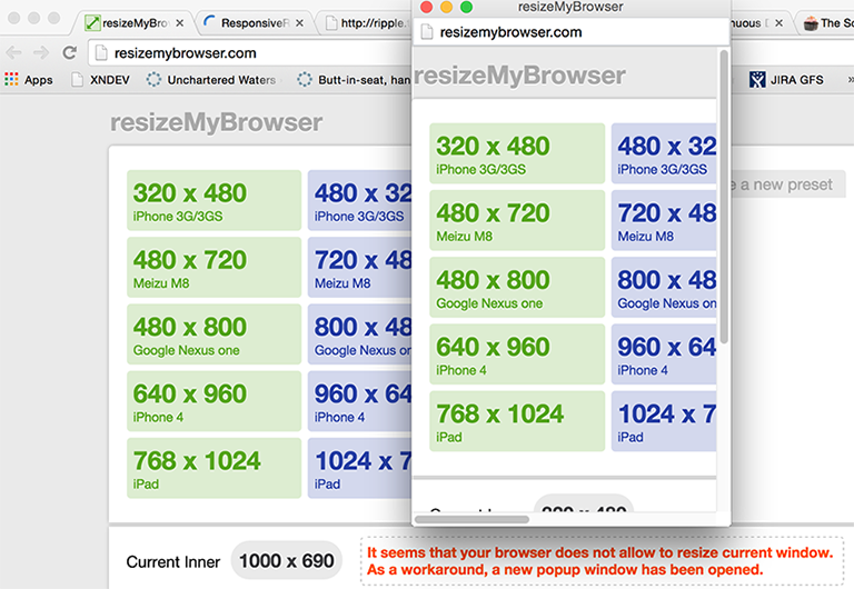
Developers can also use services that reformat their browser to the screen sizes of the various mobile devices they are developing for. Resizemybrowser.com, for example, has a selection of devices from which to choose. Click on a device and a new browser window pops up that's just the right size for that device. Best of all, the site gives you both the portrait and landscape mode. When you do this, however, make sure you use the right browser. If you are testing an iOS device, for example, use an Apple Mac computer with the Safari browser, and use the Chrome browser when testing for Android devices.

Resizemybrowser.com can display your website as it will appear on a wide variety of mobile screen sizes.
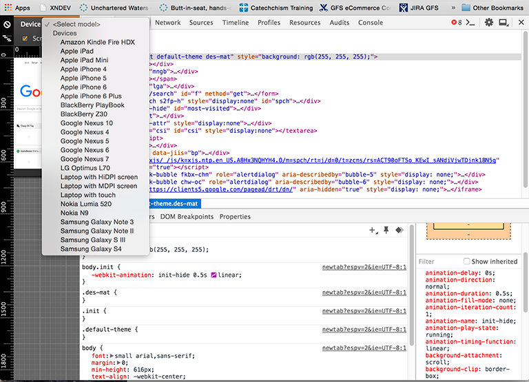
Browsers have similar resizing tools. For example, Safari has an extension, Responsive Resize, that adds buttons for various screen sizes, and previews are available in Google Chrome. Just try View->Developer->Developer Tools, then click the picture of the mobile device at top-left. You'll see a preview of the current website. The "select device" dropdown gives you device options.
The screen size preview feature in the Google Chrome browser.
Despite the abundance of tools, simulators remain limited in what they can do. Unless your budget is incredibly strapped, try to keep on hand a few of the most popular mobile devices that your customers are using so you can check your website yourself. The most common real-life problems I've experienced lately are slow downloads and slow renderings, which can lead to users abandoning a site, especially if they're coming in on slow cellular or Wi-Fi connections. This issue isn't new to responsive design, but the problem becomes bigger when a fully loaded page has to execute JavaScript in order to figure out how to display itself on a slow mobile device.
A classic low-bandwidth example is the Internet access available on a plane, or the congested bandwidth available on the free Wi-Fi in an airport. During a recent plane trip, I went to the Twitter web page, which took about four seconds to load and display a textbox I began to type into it immediately, but the code that's supposed to show the number of characters and handle multi-line input took over a minute to run!

Before: An improperly formatted Twitter caption.
After: Properly formatted Twitter caption after JavaScript load.
A stopwatch, combined with developer tools, might be good enough to know how long a page takes to render, but it doesn't tell you what the potential is to speed things up. Google's PageSpeed Insights is an optimization tool for responsive websites that provides information on speed and usability, along with advice on how to fix it. The Firefox plugin YSlow is another good tool, although it seems to be limited to Firefox version 38 or earlier.
Native applications
Native applications tend to handle resizing more easily, but they can also be harder to simulate and test. Apple's Xcode tool, which requires a Macintosh, includes iPhone and iPad emulators; the Android SDK includes an emulator.
Social/local
The term social/local/mobile, sometimes called "SoLoMo," means that the device works in your local language and that it is location-aware. In addition to the alerts you receive when your friends are nearby, local-aware applications can screen out messages that aren't relevant, like this one, which wouldn't apply if you lived in, say, Florida.

Flood warning Twitter image from AXTfloods.
On the other hand, if I was in Austin, Texas, at the time, or if I had family or a concentration of friends in that city, the application might decide to deliver that message.
The classic way to test this is to get in a car or train and just use the app. That is something that Kyle Drake, founder of Neocities and a former tester at Esri's GeoLoqi division, still does. He rides his bicycle around the city of Portland, going through known changes in cell coverage, and hitting known event triggers along the way. This is the last step for him: the system testing step. But not everyone wants to move around to do testing. If location matters, consider using a location spoofer on iOs or Android to change location virtually, without leaving your desk.
Social applications such as Facebook, Twitter, and Pinterest have a similar problem; you may want to simulate posting when the service is down or fails. You might also want to simulate the service locally to make interactions (and thus automation) fast. In the first case, you could post to a known bad IP address, which will simulate a timeout (try 126.0.10.50). In the second, you might record the interaction and replay it using a service virtualization tool.
Another option that covers both responsive design and local is to crowdsource: hire a large number of testers who work anywhere for small amounts. Crowdsource test companies like Testlio, Applause Media, and 99Tests have large databases of potential testers in the field. They can spin up a test cycle quickly and gain a significant amount of coverage, often over a weekend. That means a test report Sunday night that either finds blockers or not. That could compress test time while increasing coverage.
Due to the compressed time schedule and lack of subject matter expertise on the part of testers, crowdsource efforts tend to find obvious issues involving the user interface, device compatibility, and performance over a slow network. While crowdsourcing can augment testing, especially for SoLoMo, it is unlikely to replace it.
Both programmers and testers benefit
Service virtualization tools allow testers to record the exact interactions with web services, while spoofers allow them to simulate massive changes in geography without getting on an international flight. These kinds of tools don't just benefit the tester; they also aid programmers in figuring out how to interact with a service, while on the responsive side, tools like PageSpeed Insights can aid in the front-end development effort.
Critics might say that these approaches are not testing, and strictly speaking they may be right. But they can help testers provide valuable information to management on the status of the project or product, and to the technical staff on how to improve it.
Taken together, these steps can help you make the team move faster, do better work, reduce debugging time, and provide more value to customers sooner. What's not to like?
Keep learning
Take a deep dive into the state of quality with TechBeacon's Guide. Plus: Download the free World Quality Report 2022-23.
Put performance engineering into practice with these top 10 performance engineering techniques that work.
Find to tools you need with TechBeacon's Buyer's Guide for Selecting Software Test Automation Tools.
Discover best practices for reducing software defects with TechBeacon's Guide.
- Take your testing career to the next level. TechBeacon's Careers Topic Center provides expert advice to prepare you for your next move.


